So I was thinking it would be fun to share some of my design work with you all. I’m going to start by sharing a project that’s actually just starting, and share weekly as it goes.
It’s a little scary to do this, especially since it’s a project working in something I haven’t really done too much of! (Here is my last attempt at some hand-lettering.) But, such is the design life. I have found that through practice, either in the writers’ group I used to be in, or through regular critiquing in graphic design school, it gets easier to put one’s rough work in front of others, and allow it to be judged.
Deep breath! Here we go.
So in one of my classes at school (Visual Communications III), my teacher has given us “carte blanche” to explore things that interest us, for our main assignment for the class. As long as we keep him updated with our progress, we can do pretty much whatever we want. I’ve always been intrigued by hand-lettering (see here in case you’re not familiar with what it is) so I signed up for a Skillshare course to learn it. (Full disclosure: If you want to sign up for it, and it’s your first Skillshare class, and you use this link, I get $10 off my next Skillshare class.)
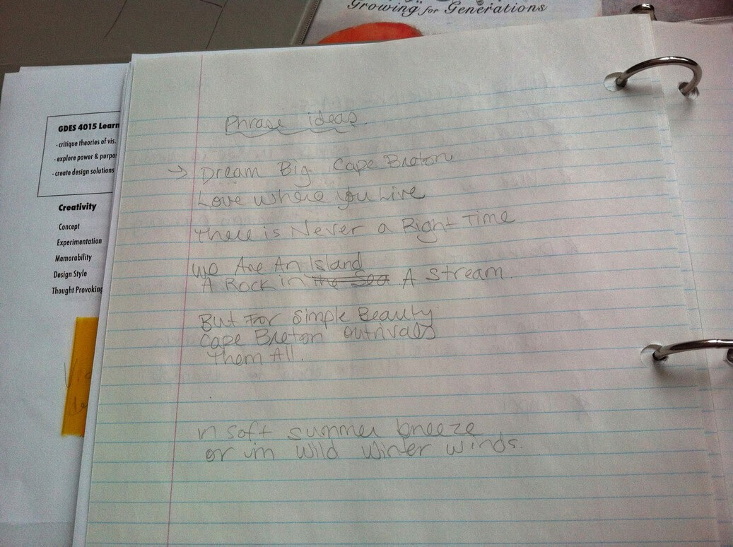
So the first step in doing a hand-lettered piece is to pick the phrase you want to do. I decided I wanted to do something that related to Cape Breton, so that if it turns out really rad, I can possibly sell prints in my Etsy shop. So after watching the first video, I sat down with a piece of paper and a pencil, and thought of some ideas. (That’s the image at the top of this post.) I decided on “We are an island, a rock in the stream.” It seemed like it would be a good fit because people would recognize it, and there are lots of ways I could work with it. I didn’t want to do “Dream Big Cape Breton” because I wanted to try something new from the phrase I think about and work with all the time. The Alexander Graham Bell quote (“But for simple beauty, Cape Breton out rivals them all”) was a tad too long for what I wanted. (Edited: A keen reader noted that I may have to get permission from the songwriter to use the song lyrics if I am selling the product. I’ll look into it and let you all know in the next post on this project!)
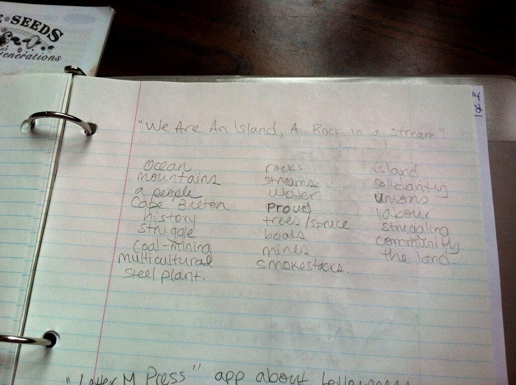
The next step is to do a “word dump” and to write down all the words that you think of, when you think of your phrase, to mentally set the tone and start thinking of imagery.
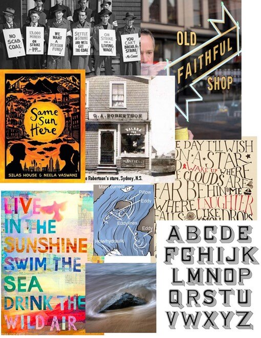
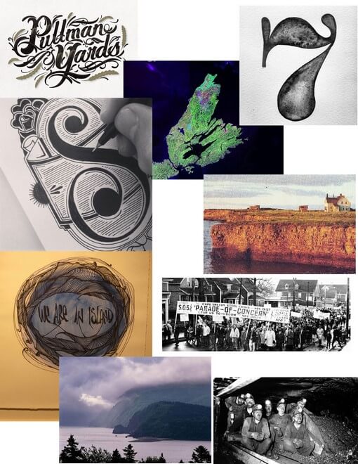
Then it’s time to do research. Yay for the Internet! I use Pinterest a lot (and here is my Hand Lettering board), as well as plain old Google Image Search. I save the images to my computer and then use Photoshop to make simple moodboards. Moodboards set the tone of your project and are a great way to communicate to a client or an instructor what your goals are for a piece, before you’ve even started on the design. Here are the mood boards I made:
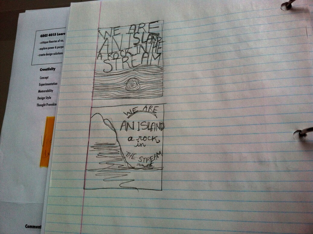
(A note on copyright and links: when I first posted this post in February 2014, I wasn’t planning to link through to each piece I’d used in my moodboards. But, after some more thought in May 2014, I decided I should give credit to the source of each of these images, even though I’m not claiming them as my own work. So from top: coal miners striking. Old Faithful Shop window, “Same Sun Here” book cover, “Some Day I’ll Wish Upon A Star”,“Live in the Sunshine” lettering, Vintage-looking alphabet, “Pullman Yards”, Hand-lettering with a felt-tip pen, Cape Breton Satellite image, number 7, coal miners underground. Missing: I forgot to note at the time the sources for the photo of the G.A. Robertson store, the rock-in-water diagram, the rock in water image, the house on the cliff, the striking miners and the Ingonish coastline, and and went to find them again and couldn’t. )Then, since I was so excited, I did two mini thumbnails of ideas I was already having.
And that’s how far I’ve gotten! I’m really excited about this project, on a number of levels. One is that I can’t wait to push myself to do hand lettering, and I’m also excited to produce something cool that also represents Cape Breton pride.
And like any crit session in class, I’d love to hear your thoughts on my project so far!
(Edit: As of June 25th, Parts Two and Three have been posted and you can check them out!)


This is such a fun and fitting project for you Leah! I can’t wait to see it evolve.
Thanks Teach! 🙂
Love hand lettering. Hope you’re having fun with it!
Thanks Krista!! 🙂
awesome!
i have finally narrowed down my possible phrases to 2. maybe i can just do them both! (i seem to be a bit stuck on the fact that i do not have a light table for the final step, but…. whatever. i ought to just start anyway)
i love the mountain in your second thumbnail. i really want to experiment more on getting words into shapes.
Hey Haya! Can’t wait to see what you do with this course, too! When I need a lightbox and I’m not in school, sometimes I’ll put a lamp under a glass-topped side table that I have. Another person flips their laptop onto its side and uses the screen as a light table.
oh that is an interesting idea! we sadly do not have our glass coffee table anymore but now i have ideas for rigging something up using things we’ve got
I’m excited to see both your progress and the final product! Hand lettering has always seemed both luxurious and intimate, very personal.
Ooh, good words Alex! You’re spot on, too.
This looks like a fun project! Makes me want to get back to doing saome lettering too! And I loved the link you have for Mary Kate McDevitt! I hope you keep sharing this project with us so we can see where it takes you!
Thanks Rhonda! Yes, it is a fun project so far. And Mary Kate McDevitt rocks, hey? I’ll definitely keep sharing, for sure.
Excellent presentation Miss. Has all the exhilaration of first-thoughts energy. The “Wow! I’ve got a great idea”. Good job.
Thank you my dear! I miss sharing great ideas with you. 🙂
Like the two concept pieces you’ve done so far. Both the design and the lettering are off to a great start! Best with this.
Thanks, Brett!