In my Introduction to Web Design class we’re designing a website. It can be anything we want, including a re-design of an existing website, so I’m taking this chance to redesign this blog, Dream Big Cape Breton! (You won’t get to see the changes til they’re all done, but I’ll try and share bits of the process along the way, as I learn them!)
It’s exciting! So far we’ve done a Client Questionnaire, a 6-page document where we “interview” the client, which is ourselves at this point, since most of us are doing our own websites or portfolios. Then we did a Site Map, and then Moodboards and Wireframes.
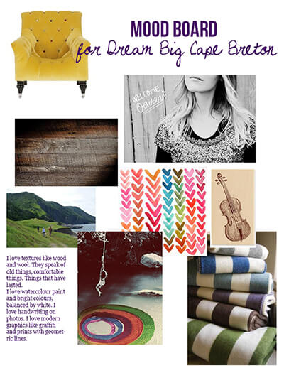
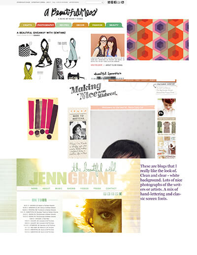
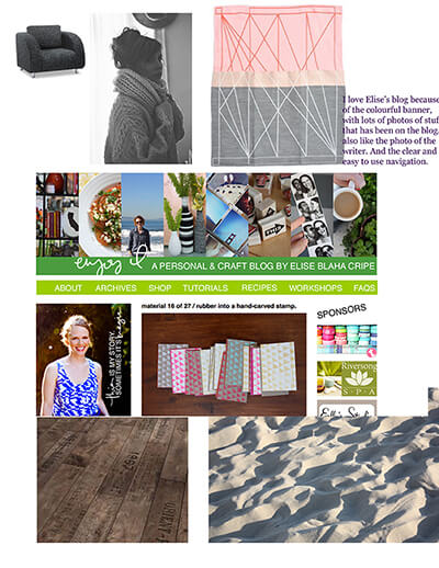
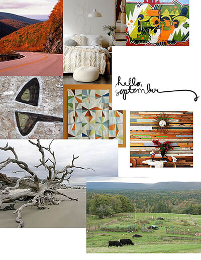
The moodboards are my favourite part of the design process, by far. The instructions were: “Gather visual inspiration for your site. Inspiration can come from color schemes, textures, typography, interface elements, overall design, photography, illustration styles, etc.” So basically, go on Pinterest, haha.
But seriously, I did use Pinterest to gather images and see them all in one place; you can see the board here: Blog Redesign Moodboard.
And here are the moodboards that I made for the assignment. Do you get an overall “feel” when you look at them?
Image source info: Many of these images’ sources can be found on Pinterest, by clicking on the image in the board there. Others that weren’t on Pinterest, I found through Google Images and downloaded directly onto my computer without writing down the source (bad me!). However, I figure that’s OK since I’m not passing them off as my own, I’m just using them in a collage, so it’s like cutting pictures out of magazines. (If I was going to use the images in a collage that I would be selling or crediting entirely to myself, I’d make more of an effort to find the images’ creators.) The bottom shot of a farm is by my friend Brooke Oland, and I downloaded that from his Facebook. (Hi Brooke!)
As much as possible I try to follow LINKwithlove’s principles about images on the Internet.
Interested in my ‘back to school’ experience? Read posts here and here.


Hi 🙂