Back in February of this year I started on an independent project for school, learning some hand-lettering. I’m a huge fan of Mary Kate McDevitt’s work and wanted to learn some of the techniques of the beautiful art of letters, so I signed up for her Skillshare class for $20 and got started. This post you’re reading is part 3, so if you want to catch up and see how I started my lettering project, check out parts one and two first.
Alright! So onwards with part three.
So, you’ll remember that at the end of part two, I had an inked version of the drawing ready to be scanned into the computer.
I have a scanner at home and so I just scanned it in using that. A few things I did at the scan stage: I changed my resolution settings to 600 dpi, which just means more detail, and a bigger file size. I also saved it as a TIFF file, and scanned it on a black-and-white setting. The drawing is black and white already, which just helps when you’re turning it into a vector later on. (All of these steps are covered in Mary Kate’s Skillshare video, linked to above, in case you’re thinking of taking it.)
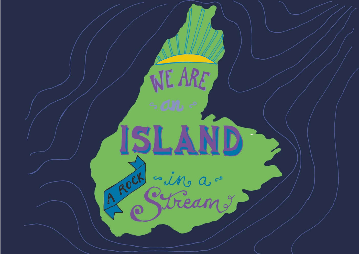
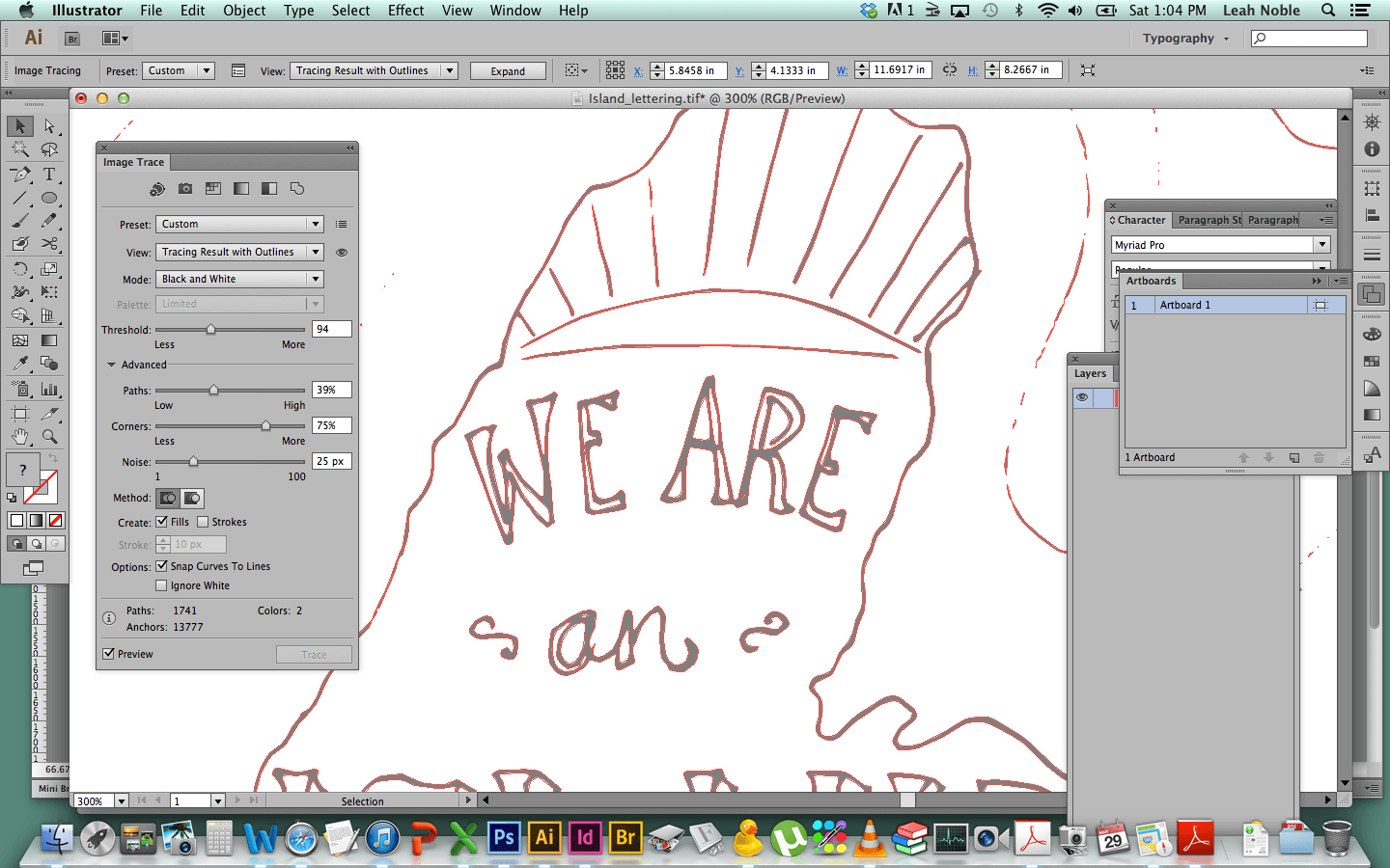
So the image at the top of this post is what the drawing looks like after I’ve scanned it and when I open it up in Adobe Illustrator, and then start the Image Trace process. If you click on the image it will open it up bigger and you can see the Image Trace dialogue box and the settings it offers.
Image Trace is a powerful tool within Illustrator, and basically it lets you take photographs or scans of images, which are just made up of pixels (and have a maximum size they can be reproduced at before they start looking bad), and turns them into vector files. I don’t know the math behind vectors, but working as a designer, I do know that they turn an image or illustration into a whole bunch of paths and points, which you can tweak and change. It also makes it so that the artwork can be resized up and down many times without losing the crispness of the lines and colour. And, it makes it super easy to change colours of individual parts of an image. (If you want to learn more about vectors and rasters, this is a good article.)
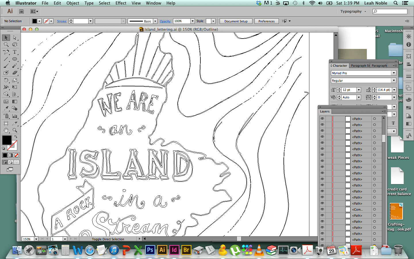
I won’t get too much into the details of the Image Trace process and which settings I used, but basically I played around with it a bunch to make sure the lines were getting turned into vectors in a way that looked how I wanted them to. If you have Illustrator and you want to play with Image Trace, that’s what I’d recommend, is just playing around with it. Make sure your “Preview” button is checked so you can see the changes happen as you play.
So you can see in this image above (which is on “outline” view) that the artwork gets changed into a whole bunch of lines. Then I go in and spend some time deleting chunks that I don’t need (like the insides of letters; sometimes they get made into their own object but if you don’t need to control the colour at that spot, it’s just a useless vector shape and you might as well delete it).
I pretty much always get super excited and just start changing the colours of things, too, even before the drawing is done and “ready” to be coloured. It’s just so easy and fun to see!
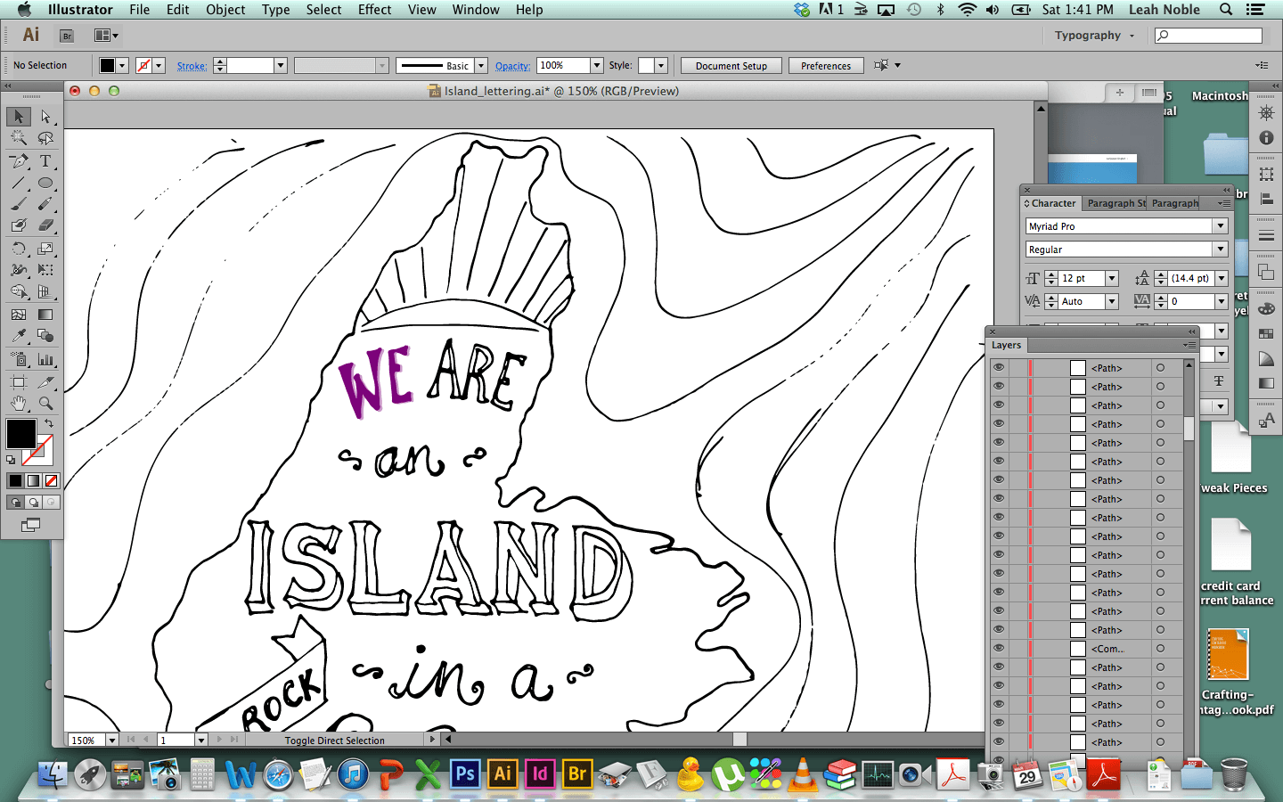
But, then I decided I wanted to make the lines that go around the island to be stronger and not all broken up like they are in the image above (which happened because in the first trace they just happened to be a bit lighter than the rest of the drawing), so I re-traced that part of my inked drawing by hand, and scanned that in, used Image Trace and made them vectors too.
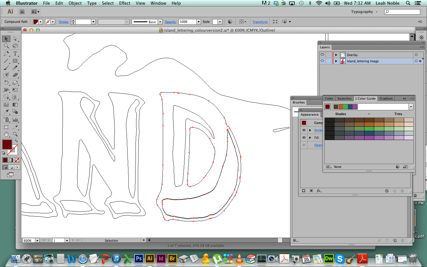
This screen capture above is showing the drawing on Outline view, and I’m using it just to show you how the illustration, once vectorized, is made up of a bunch of separate shapes, all of which are made up points. I can click on any of those points and change their position either slightly or a lot, and also change the curves between the points. I can delete them or add more points to any line. It’s great fun! (Nerd alert!)
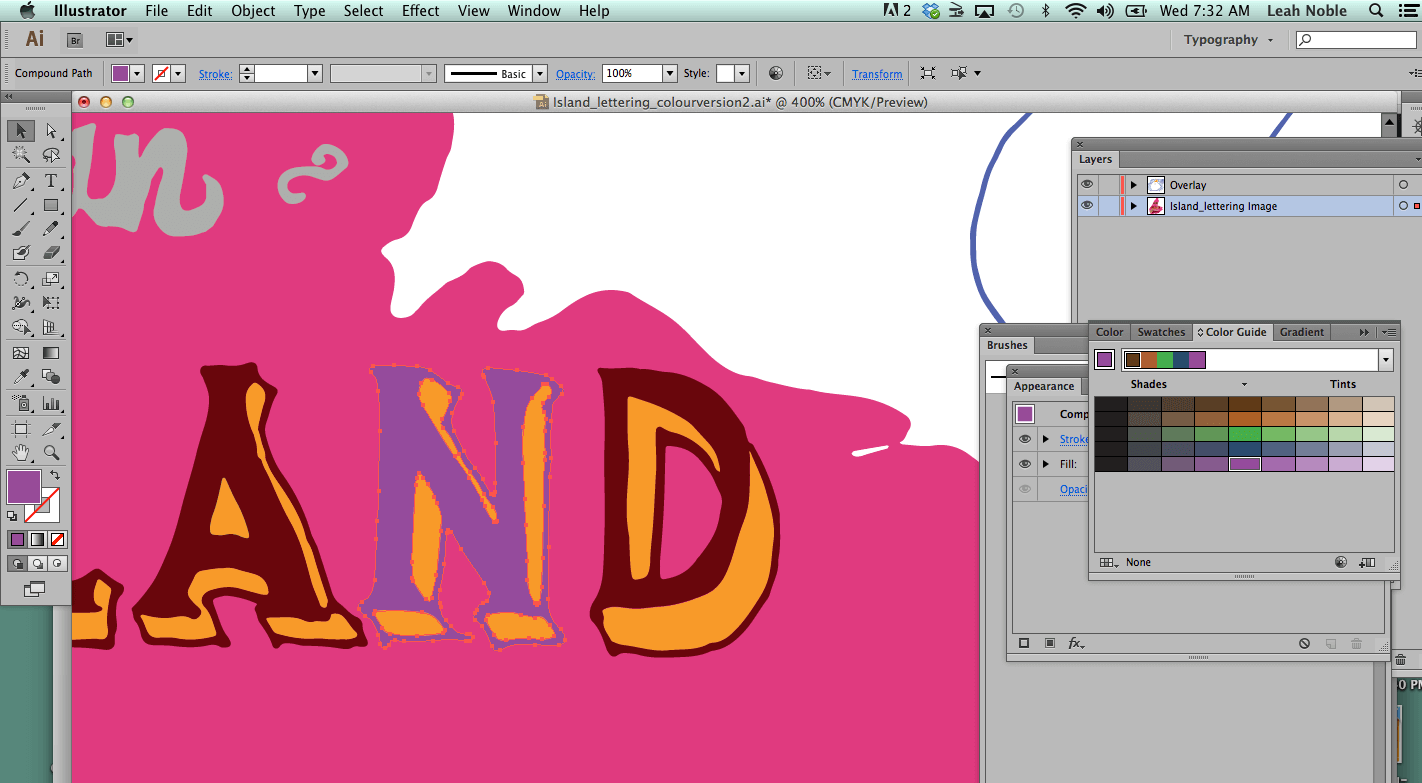
And this screen capture above shows me playing with colour. Again, each shape is editable on its own. At this point it’s a bit like Microsoft Paint that we played with as kids, with the Paint Bucket tool, just filling stuff in like a boss.
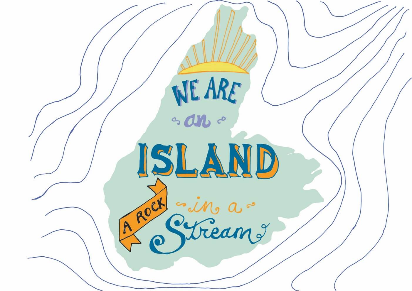 So in the end, I submitted three different colour variations of the print to my instructor. This one above was the first one. I looked at my moodboards (from part one) a lot when I was deciding on colour. The first one doesn’t look a lot like the moodboards but I wanted a soft palette with a hit of orange and that’s what I came up with.
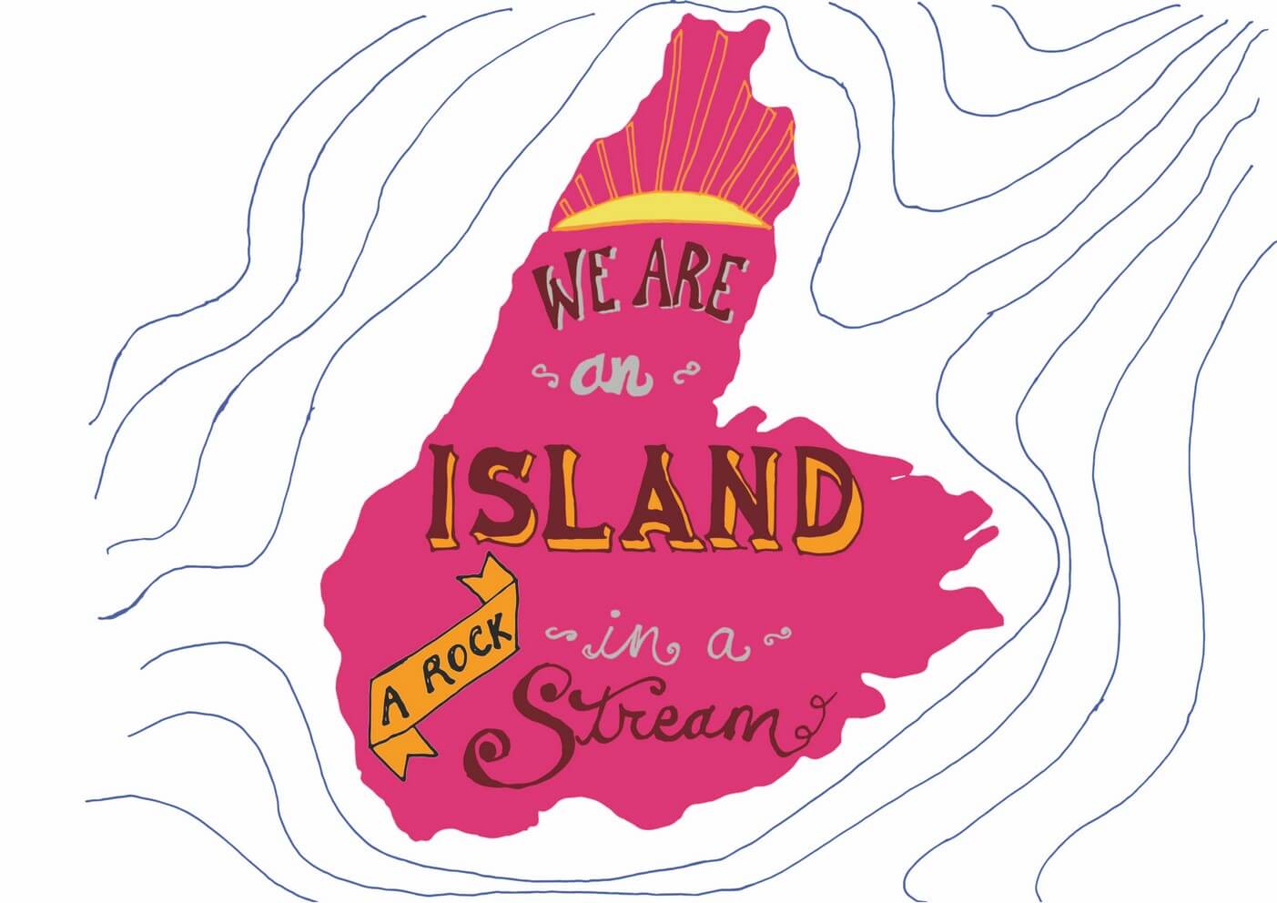
The second one I wanted to have more vibrant and “punchy,” like the “live in the sunshine” lettering from my mood board.
 Andd for the third one I looked at the satellite image of Cape Breton for colour inspiration.
Then I printed them off on card stock and submitted them to my instructor. And that’s that!
To me, finishing a project is more important than worrying about details too much, although that’s always a tough balance to strike, because you do want your work to be precise and well-done.
So, though I’m happy with them and glad I’m finished, there are bound to be imperfections and things that a more experienced letterer might look at and go, “Well, she should have done X and Y.” But, I’m glad I pushed through, though, on this project, and got it done! Overall I like it a lot. (Looking at it now, a few months later, the lines around the island bug me a bit… they seem too light and without purpose. I like them in the version with the dark background, though.)
What do you think? Do you like the illustrations? Which colour version is your favourite? Would you buy a print if they were available? (And be honest, please!)
A note on copyright: the lyrics I’m using here are by Kenzie MacNeil, from the song “The Island.” I reached out to Kenzie to ask his permission to use the lyric, and after we spoke on the phone, he hasn’t had a chance to respond to my follow-up email, so I’m not sure where we stand with that. However, I am not selling this product, only using it for educational purposes, so technically I’m within my rights to use these lyrics, but of course I want to clear it with Kenzie as well, and also look into getting permission so that I may sell the prints someday.


they look awesome!!
i never actually got anywhere with my project, but maybe i’ll pick it up again some time in the future.
i think my favourite is the satellite inspired one, followed up by the soft palette, which looks kind of retro. i would totally buy one!
Honestly, the thing that kept me working on it was that it was due for school credit!! Thanks honey for the comment! xo
So glad to hear you got so much out of Mary Kate’s class! She is definitely a favorite of mine and learning her process really has helped me validate my editing process with digitizing my lettering. Your final pieces look great! I really like the one with the darker background. You have an excellent scanner btw!
Thanks so much, and I just went and checked out your work and I’m blown away! I love love love connecting with other young graphic designers. Keep up the awesome work!!!
Fantastic! I love the colours in the upper left one in your bottom picture.
Thanks so much Krista!! 🙂
The dark background of the third one does the best job of emphasising the islandiness (that ought to be a word). Isolated in the wine-dark sea. Then again for the main lettering I prefer the black-topped orange-sided colours in the second one, although not the grey letters, which I find a bit hard to read against the pink/purple/fuchsia (never sure what to call that colour) background. You will no doubt have learnt in your studies to take into account the various potential colour-blindnesses of your audience.
Strange that the second and thrid ones both look nice and bright on the page but pretty darned dull in the photo. I presume that was just the camera struggling in whatever the lighting conditions were.
Thanks Joe for the comment! I think the difference between the print and the screen versions is just the normal difference between print and screen. Screens make things look “glossy” and super sharp and bright, which is because they’re lit up. You just can’t really get the same effect in print, I’ve found.
Honestly, colour-blindness wasn’t really covered in our course. That’s a good suggestion to make to the instructors!