Back in February of this year I started on an independent project for school, learning some hand-lettering. I’m a huge fan of Mary Kate McDevitt’s work and wanted to learn some of the techniques of the beautiful art of letters, so I signed up for her Skillshare class for $20 and got started. This post you’re reading is part 2, so if you want to catch up and see how I started my lettering project, check out part 1 first.
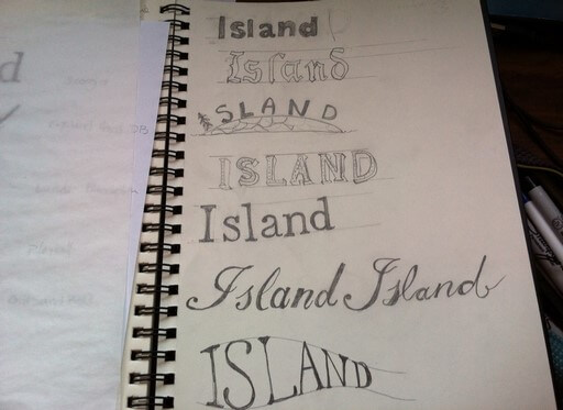
So, the next step was to pick a word from my phrase, and draw it in a variety of styles. That’s what the picture at the top of this post is showing. From the top, the styles are: sans-serif, blackletter, representational, drop shadow, serif, script and I think the last one was whatever style you wanted.
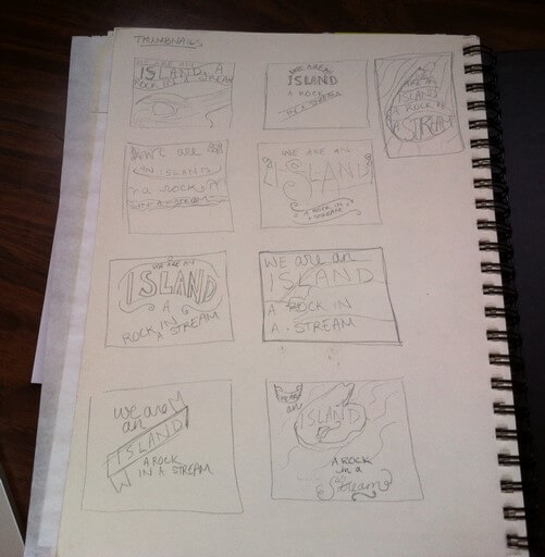 Then I drew thumbnail sketches of how the whole layout might look. You do lots of thumbnails so that you can really work out different ideas and compare them to one another, and get a sense quickly of how the words will fit on the page.
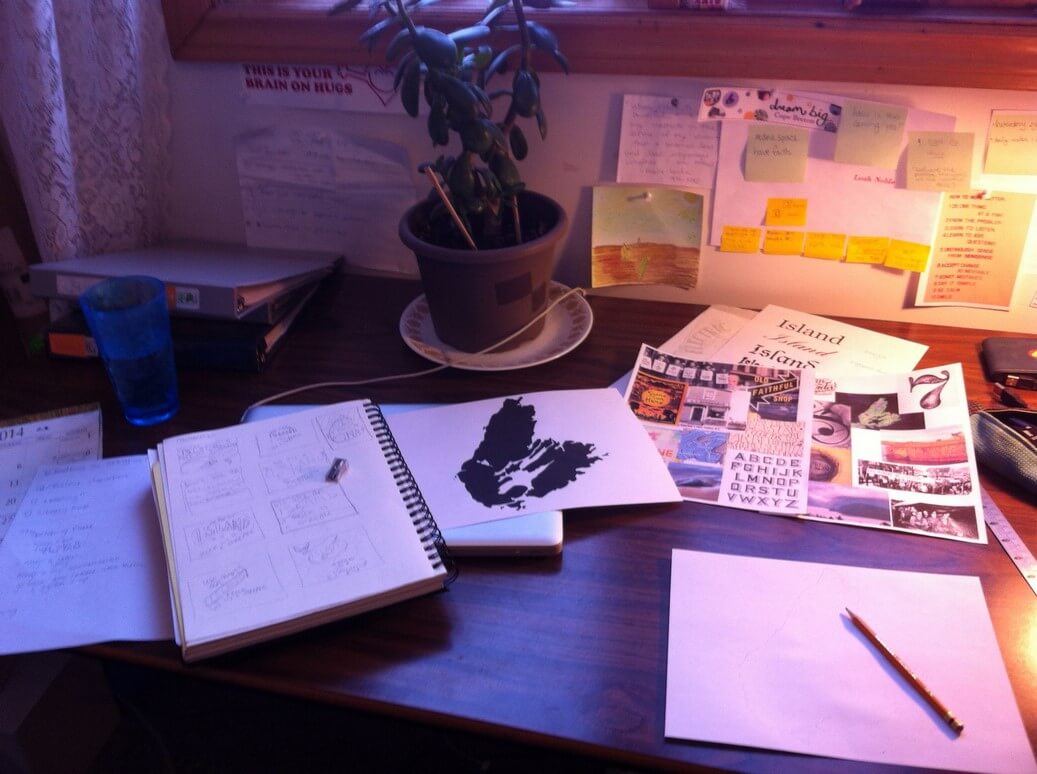 This picture shows my desk and what all was on it, while I was working away. You can see my moodboards printed off, as well as a sheet of paper with the word “Island” in a bunch of different fonts. My computer is under my sketchbook and the piece of paper with the Cape Breton outline on it.
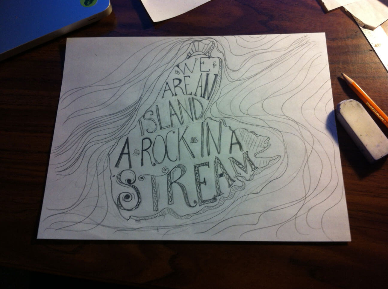 So then I spent several hours making my first draft. For this first layout idea, I wanted the letters to all be touching, like in the “Someday I’ll wish upon a star” example from my moodboard.
I sent this draft both to my instructor at NSCC, Brian Geary, and to Mary Kate, the Skillshare teacher, and asked them for feedback.
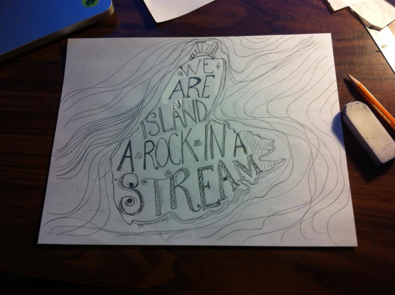
This image above was Brian’s feedback that he emailed back to me: he used Photoshop to take my image and move a few things around, showing me how better to place my words in the top portion of the island.
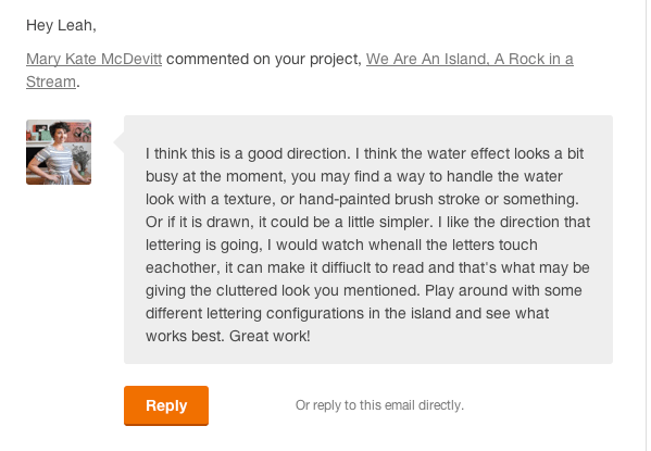
And this was Mary Kate’s comment on my work:
(Of course I was a bit starstruck even getting feedback from her at all! Did I mention she’s amazing?)
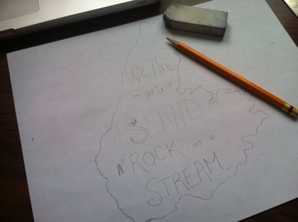
So with all of that in mind, I started again to draw, likely a few days later. I decided to lay out the piece a bit differently, still in the island shape, but with the words not touching like they were before.
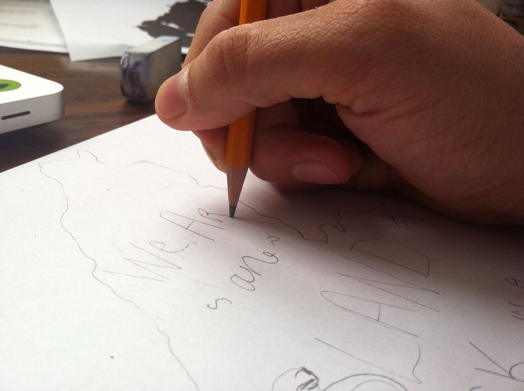
It’s a long process. A lot of drawing, erasing, drawing again. Making it as close to perfect as you can. If your pencil drawing (and final inked version, which comes from it) is really good before you scan and vectorize it, then you spend less time on the computer later.
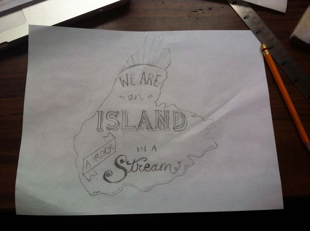
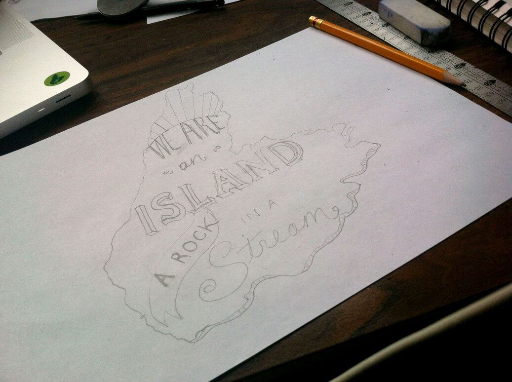 Eventually I got to this stage above. Then I decided I wanted the banner around “A Rock” to be squared off.
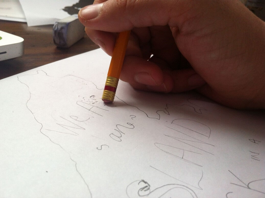
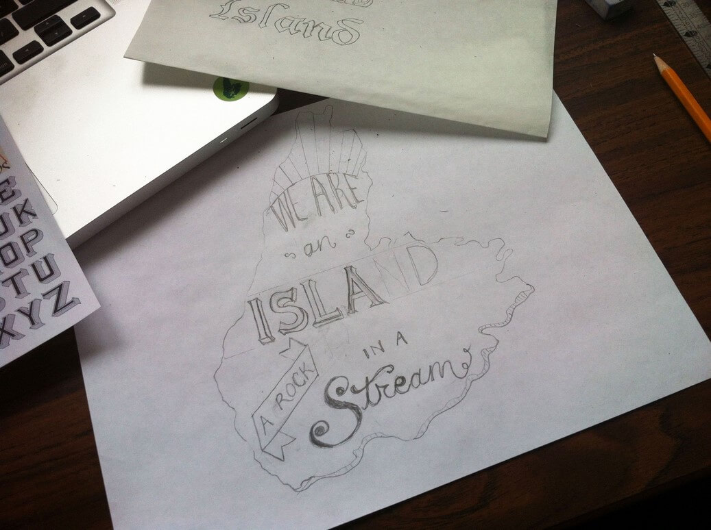 In this shot, the letters “N” and “D” on “Island” needed more work, so I erased them and did them again.
Eventually, after several hours, I was happy with how it looked, as well as feeling like I wanted to move forward, so if there was any part that still needed work, well, oh well. It’s easy to just beat myself up mentally, comparing my work with someone like Mary Kate who has been at it a long time, and try to make it perfect. But, at some point you’ve just got to move forward and finish a project. Doing it from start to finish is how you learn, and get better for the next time.
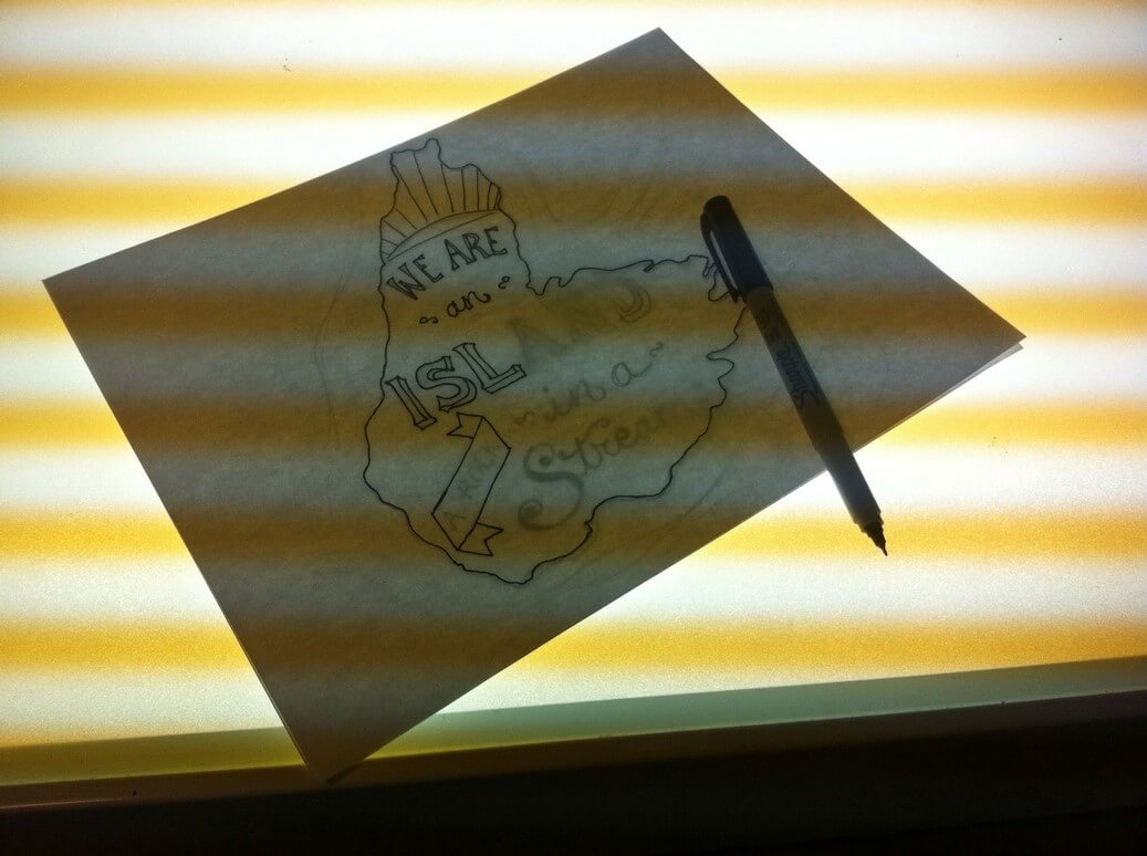
I took the drawing to school and used a lightbox there to trace over my pencil drawing with a Sharpie fine-tip marker, onto a new piece of paper.
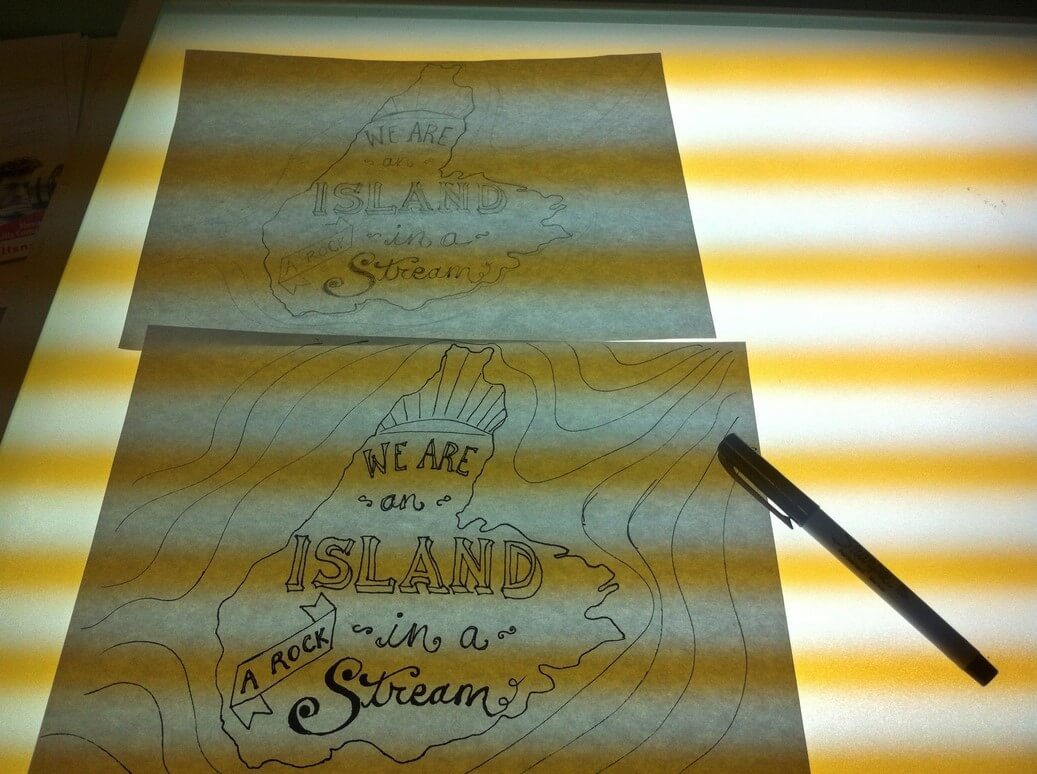
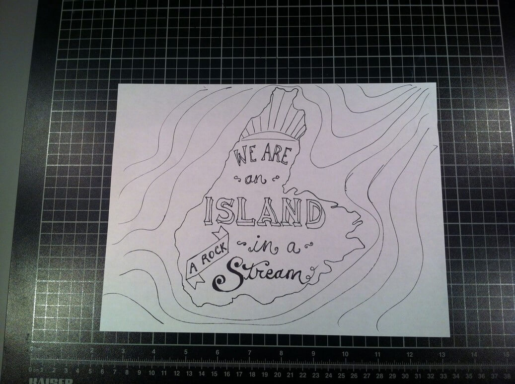 And then I had this! The final inked version. In the third and last part of this process, which I’ll post on here in the next few weeks sometime, I’ll share the vectorization process, and what I did with it once it was on the computer, and what colours I used to bring it to life.
(Edit as of June 25th: Part Three is now up on the blog and you can read it here.)
A note on copyright: the lyrics I’m using here are by Kenzie MacNeil, from the song “The Island.” I reached out to Kenzie to ask his permission to use the lyric, and after we spoke on the phone, he hasn’t had a chance to respond to my follow-up email, so I’m not sure where we stand with that. However, I am not selling this product, only using it for educational purposes, so technically I’m within my rights to use these lyrics, but of course I want to clear it with Kenzie as well, and also look into getting permission so that I may sell the prints someday. .

It must take such a long time to do this!
The end product looks very nice.
I hope Mr. MacNeil gets in touch soon.
I really like seeing the progress you’ve shown here. I’m into hand lettering too, but never make the time to practice.